


A Multiplayer Battle Game of Laughter, Strategy, and Legacy.
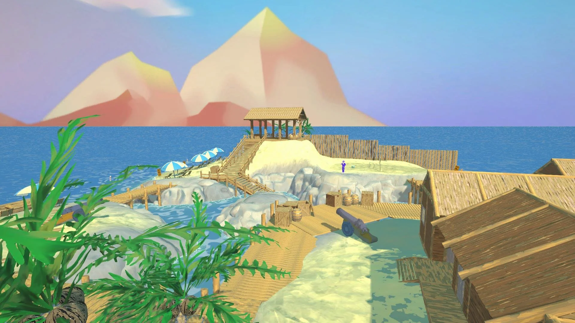
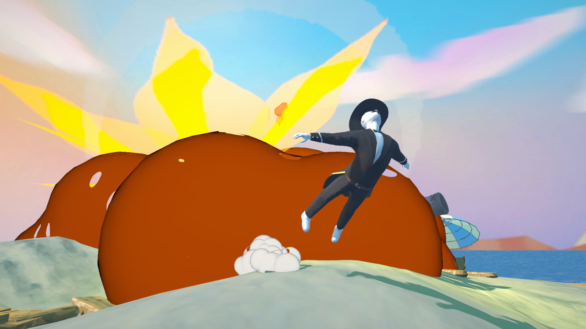
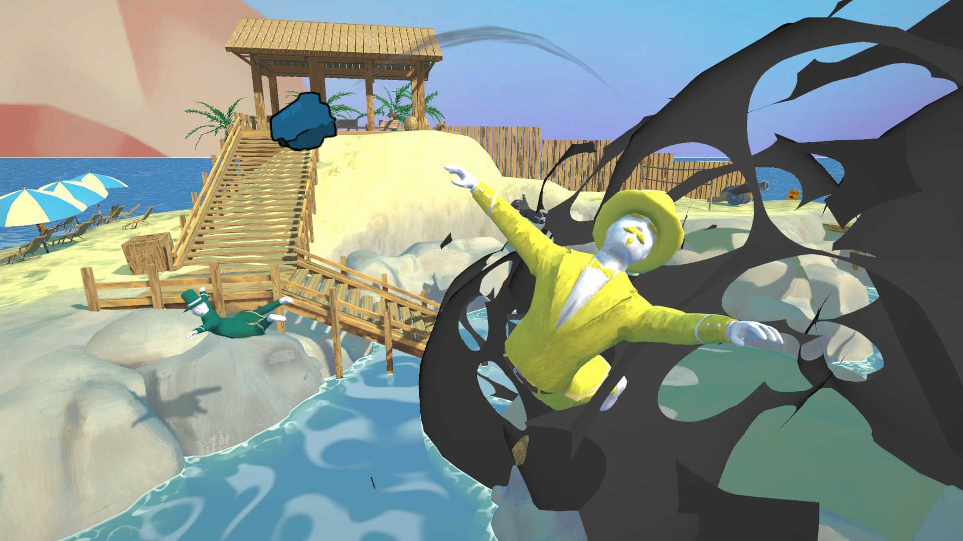
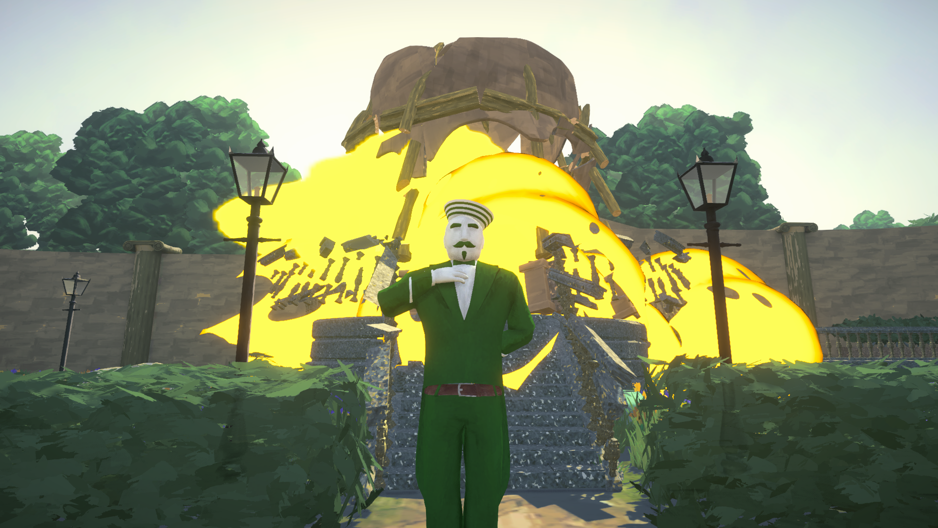
A Gentlemen’s Dispute is a multiplayer online battle game where friends and family compete to become the ultimate heir to a legendary fortune. Armed with wacky weapons and quirky perks, players fight across gardens, ballrooms, and beaches in a hilarious quest for glory.
As the Game UX and Visual Designer, I shaped both the playful aesthetics and intuitive interfaces that bring this game to life.


We released our demo on Steam in July 2024, and received a lot of positive feedback from players:
“My friends and I cannot stop playing its really fun to play after school just to mess around and be silly :)”
— Steam Review (7.6 hrs played)
“Absolutely pure hilarious concentrated fun!”
— Steam Review (6.2 hrs played)
Development Journey
From a weekend prototype to a thriving community of players, A Gentlemen’s Dispute has evolved through creativity, iteration, and collaboration. Here’s how it all unfolded.
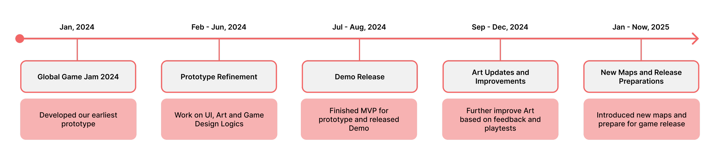
We started our development journey in January, 2024. Our team from Blast Furnace Games attended the Global Game Jam of 2024, and developed our first prototype over the weekend. The game gained a lot of interest among developers and players attending the jam, and we decided to continue developing it.
During the spring of 2024, our team spent our time outside schoolwork on refining the Game Design, and prototyping different styled UI, 3D art and gameplay logics. Over the summer, we finished most of the prototyping process, and released our demo on Steam in late July.
The demo of A Gentlemen’s Dispute gained a lot of interests from players, receiving over 3000 wishlists by the end of the year. We continued to improve our 3D art and visual art in the fall and prepare for release in 2025.
As the game evolved, I contributed by designing the visual style and improving the UX based on player feedback. My work ensured the game was both intuitive and enjoyable for players, balancing accessibility with playful design.
Game Art: From Conception to Cohesion
The visual design of A Gentlemen’s Dispute evolved from bold experiments to a cohesive style that enhances gameplay. Here's how the game art transformed into its final painterly-cartoonish aesthetic.
Version 01: Designed for Global Game Jam
During the Global Game Jam, our team established the theme for A Gentlemen’s Dispute and envisioned a bold contrast between a fancy Art Deco UI and the game’s humorous, lighthearted gameplay. I designed detailed icons and HUD elements with intricate gold textures, expecting this elegance to enhance the overall experience.
However, as we integrated this style into the game, it became clear that it wasn’t the right fit. The Art Deco aesthetic clashed with the Victorian-era setting, creating a visual disconnect. Additionally, the game’s early 3D models lacked the polish needed to complement such an ornate style, making the visuals feel inconsistent.
The intricate details of Art Deco—sharp corners, thin lines, and metallic textures—also made the HUD harder to read, adding unnecessary complexity to a game focused on fast-paced gameplay. This style not only introduced visual clutter but also increased development challenges.
Recognizing these issues, we pivoted in the next iteration, seeking a more cohesive art style that aligned with the game’s theme and prioritized clarity and player experience.
Version 02: Prototype Phase
In the prototyping phase, we explored different art styles to align with the updated 3D art, which had shifted to a blend of oil painting and cartoonish aesthetics. This pivot in 3D art influenced the direction of the UI, as we discovered that a more cartoonish style was not only more engaging for players but also allowed them to focus on the battles without distraction.
I designed various cartoonish screens and experimented with multiple fonts to find the right balance of playfulness and readability. During this phase, our main goal was to introduce elements that added interest and energy to the game. We drew inspiration from the 1930s cartoon style, as it offered a nostalgic, whimsical vibe that resonated with our vision.
Although this style wasn’t a perfect thematic match for the Victorian-era setting, playtesting revealed that it worked exceptionally well. The cartoonish UI was flexible enough to adapt to the rapid iterations of the prototyping phase, making it an ideal choice for experimentation and player engagement.
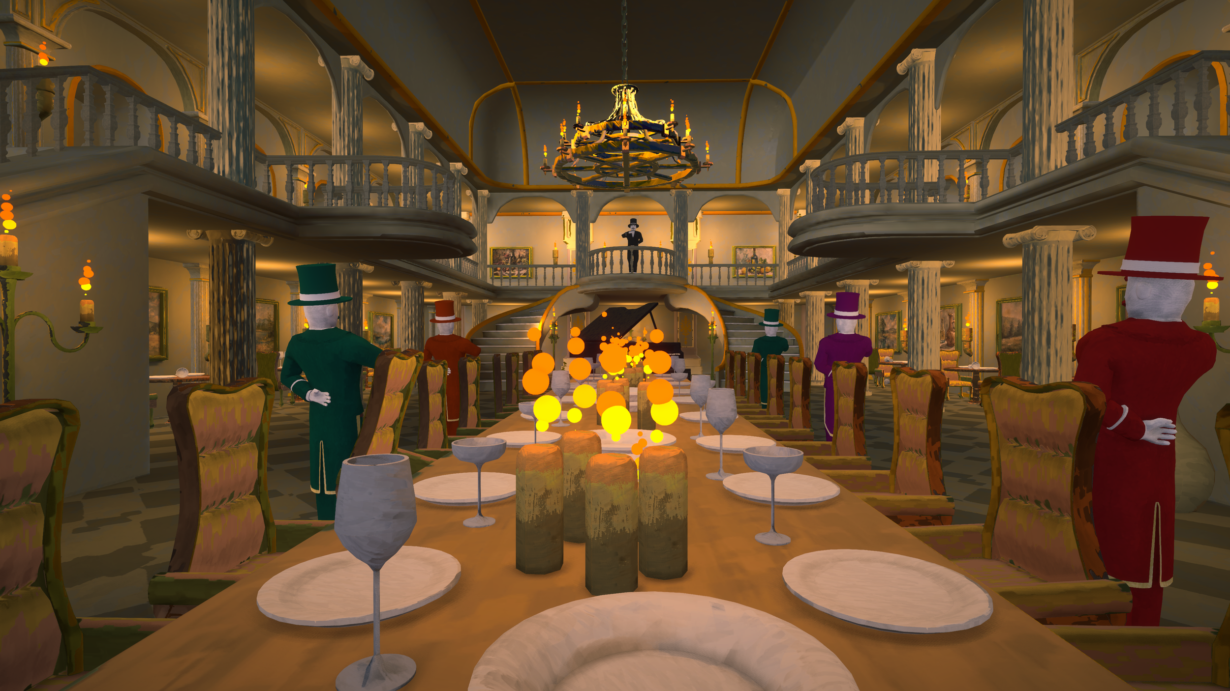
Version 03: Demo Phase
After releasing the demo, we focused on refining the visual art and UI, ultimately settling on a style that blended painterly textures with cartoonish elements, aligning with the game’s theme. I also gathered player feedback to identify areas for improvement, particularly around in-game instructions, button prompts, and the display of perks and win status.
We made a lot of changes in the presentation of the Visual Art. Collaborating with the development team, we successfully blended the UI with the 3D scene. Now the UI doesn’t feel very abrupt even if they are very stylized. With the allowance to make more stylized UI, I started to craft more buttons and icons for the game.
For the HUD UI, I drew the frames to look like painting frames, matching the various oil paintings in the family. As for the icons, I referenced our 3D models, and added customized perspective, shading and presentations.
Game UX: Enhancing Player Experience
The UX of A Gentlemen’s Dispute was designed to ensure players could focus on the fun and strategy of the game without being bogged down by unclear systems. From HUD layouts to perk visibility, every element was iterated upon to optimize the experience and reduce friction. In our early prototyping phase, we mainly focused on finishing the core functions, and setting up a game that’s fun and playable. We neglected some UX consideration in the process, so after the demo release, I started to systematically consider players’ experience in the game, and looking to improve UX for our game.
Key Challenges:
HUD Clarity:
The early HUD was cluttered and didn’t effectively communicate essential gameplay information. Using basic shapes, I prototyped multiple layouts and gathered player feedback to refine the placement of elements.
Analysis:
Perk Visibility
Players struggled to understand their perks due to unclear displays. I designed a dual solution with HUD notifications and a dedicated perk screen for deeper insights.
1. HUD Problem: Organizing Information for Clarity
The early HUD was cluttered, making it difficult for players to quickly access critical gameplay information. I began by breaking down the essential elements that needed to be displayed, such as player stats, health, and perks, and organized them into a logical hierarchy. Using basic wireframes, I tested various layouts with players to find the most intuitive placement for each element. The final HUD provided a cleaner, more readable interface that reduced distractions and allowed players to focus on the action.
Player Guidance:
During playtests, players indicated the need for clearer button prompts and in-game instructions. These improvements streamlined onboarding and gameplay.
2. Player Flow: Integrating UI into Game Navigation
To ensure a seamless experience, I created a player flow that mapped out each stage of the game: from the main menu to perk selection, gameplay, and the end screen. This flow helped me identify the specific UI elements needed at each step, such as clear navigation buttons, customization options, and loading screen indicators. By aligning the UI design with this flow, I eliminated confusion and created a smoother transition between game stages.
3. Perk System: Balancing Innovation and Strategy
The perk system was one of the most important aspects of the game, so I studied existing examples like Teamfight Tactics to understand how perks could influence player strategy. TFT’s use of augments inspired us to create perks that not only provided immediate benefits but also encouraged creative gameplay through combos. Collaborating with our game designers, we proposed key principles for the perks:
They should offer meaningful strategic choices without overwhelming players.
They should be balanced to allow players to compete, even without ideal combinations.
I also designed the perk system UI to integrate seamlessly with gameplay. Perks were represented as card stacks on the HUD and included pop-up notifications when triggered, giving players real-time feedback. This design improved clarity, enhanced engagement, and encouraged strategic decision-making in future rounds.
Reflections and Takeaways
What I learned
Key Accomplishments
Looking Ahead
The development of A Gentlemen’s Dispute has been a journey of creativity, iteration, and collaboration. As the Visual Art and UX Designer, I worked to bridge the gap between playful aesthetics and functional design, ensuring the game was both engaging and accessible for players.
Player-Centric Design: Playtesting and feedback were critical in shaping the game’s UI and UX. Understanding player needs allowed me to refine elements like the HUD, perk system, and player flow to create a more enjoyable experience.
Balancing Art and Usability: The transition from Art Deco to a painterly-cartoonish style highlighted the importance of aligning visual design with gameplay and thematic consistency.
Collaboration Across Teams: Working closely with game designers to develop the perk system taught me the value of integrating gameplay mechanics with user experience, ensuring the game felt cohesive.
Improved player engagement through a streamlined HUD and intuitive player flow.
Designed an innovative card-based perk system that added excitement and strategic depth to gameplay.
Established a cohesive visual identity that complemented the game’s tone and enhanced immersion.
The experience of designing for A Gentlemen’s Dispute has solidified my passion for creating user-centered designs that blend functionality and artistry. As we prepare for the game’s release, I am excited to see how players interact with these systems and to continue refining the experience based on their feedback. I look forward to applying these lessons to future projects, exploring new ways to make games both beautiful and enjoyable.
